 Moola
MoolaMoola Banking App
UX design Institute university credit-rated UI design certification: The brief was to take a set of pre-existing UX wireframes and develop a complete visual identity and high-fidelity user interface for a new responsive banking application
The Challenge: Playful Banking, Serious Trust
The primary challenge was to create a visual identity that felt fresh, modern, and more playful than established banks, without sacrificing the sense of trust and clarity essential for a financial product. The design had to be intuitive and engaging while assuring users that their money was safe.
Brand tone
- Playful: Using our product should be a joy for users. We’re not afraid to add some extra personality into our style like colour, animation and shape, but not at the cost of being intuitive.
- Clear: We’re dealing with people’s money, so we need to make sure to present their information in a clear and uncluttered way. White space is our friend.
- Trustworthy: Our product must convey a sense of trustworthiness in presentation.
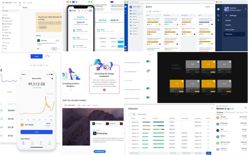
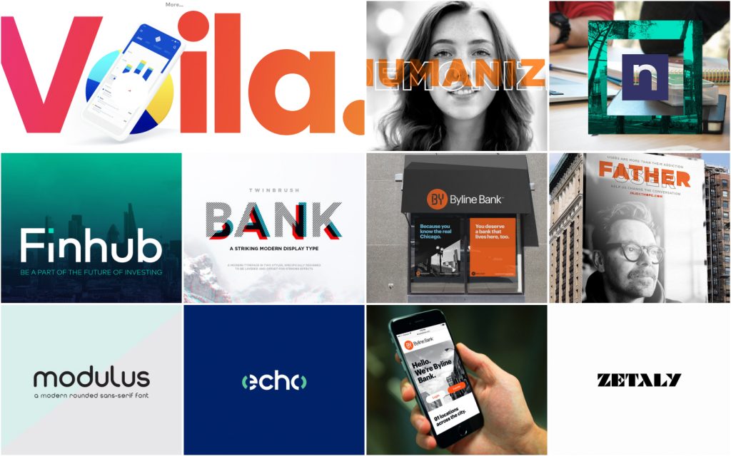
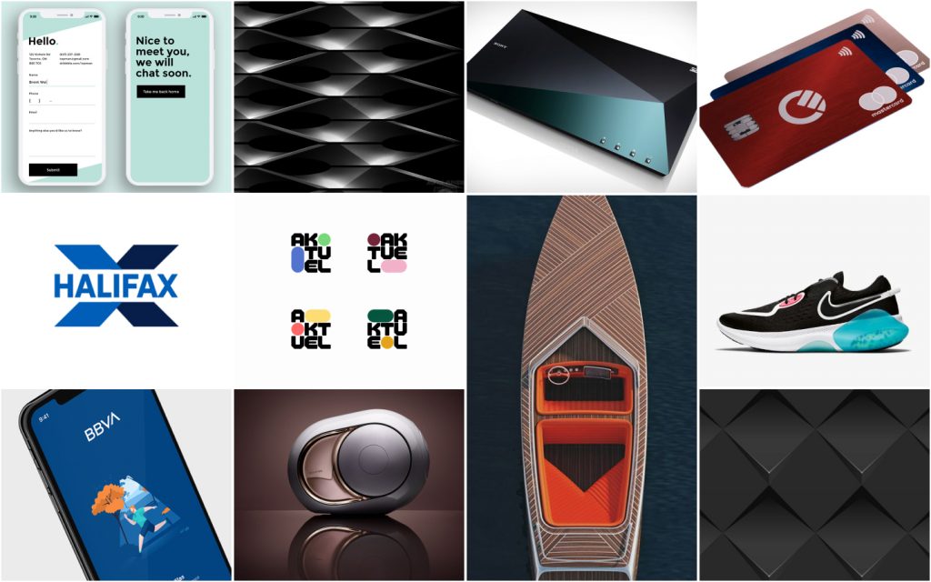
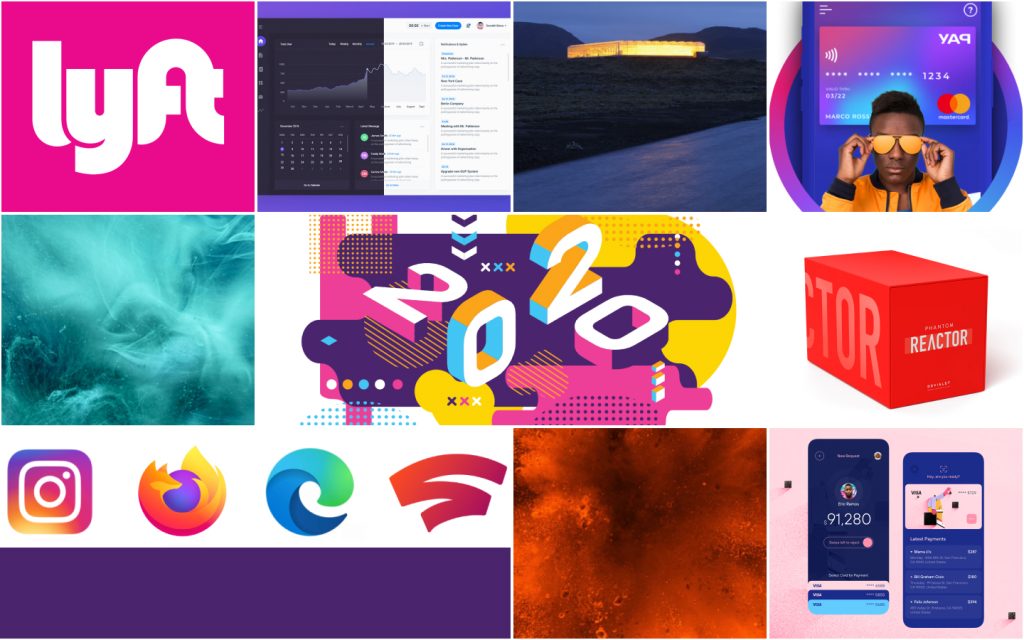
8 Mood boards

Key Objectives:
- Brand Identity: Define and apply a unique brand personality for “Moola.”
- UI Design: Create a polished, high-fidelity interface for three key screens.
- Responsive Design: Ensure the experience was seamless across mobile, tablet, and desktop sizes.
My Role & Process
As the sole UI Designer, my responsibilities included everything from brand strategy to final execution. My process was grounded in the principles learned throughout the certification course.
- Discovery & Strategy: I began by defining the brand’s core personality traits: Playful, Clear, and Trustworthy. This foundation guided every subsequent design decision.
- Visual Exploration: I explored various colour palettes, typography pairings, and iconography styles to find the right balance between Moola’s playful nature and its need for credibility.
- Layout & Structure: Using grids and a strong sense of alignment, I translated the wireframes into clean, organized layouts that prioritized clarity.
- High-Fidelity Design & Prototyping: I built out the final screens in Figma, focusing on details like spacing, colour application, and interactive components.
- Handoff Preparation (Module 10): The final designs were organized and prepared as if for a developer handover, ensuring consistency and clarity.
Design Decisions & Execution

To build user confidence, I focused on creating a clean, professional, and intuitive interface.
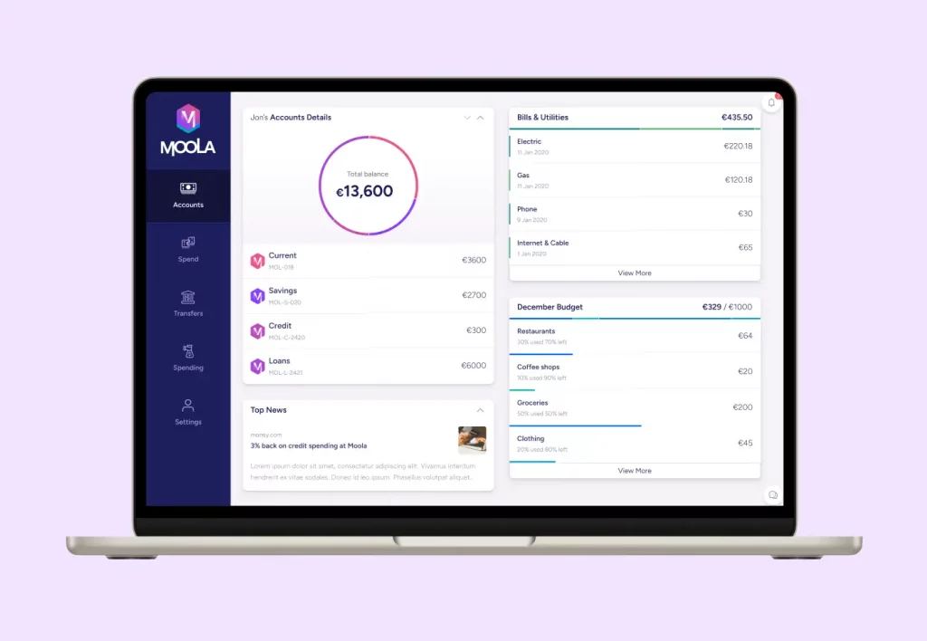
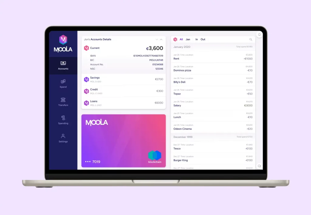
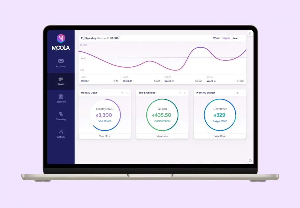
- Layout & White Space: Applying principles from Module 3 (Layout), I used a consistent grid and generous white space. This creates a calm, uncluttered environment, allowing users to easily process their financial information.
- Typography for Clarity: As covered in Module 6 (Typography), I selected a highly legible sans-serif typeface for all body copy and data. This ensures that critical information like account balances and transaction details is always clear and easy to read.
- Familiar Navigation: Following established UX principles, I chose a standard tab bar for mobile navigation instead of a hamburger menu. This ensures key features are always visible and accessible, reducing cognitive load and making the app feel intuitive from the first launch.
Brand Pillar
To differentiate Moola from its competitors, I injected personality and a modern aesthetic.
- A Vibrant Colour Palette: In line with Module 7 (Colour, Shapes & Effects), I developed a fresh, modern colour palette. I utilized the HSL colour model to create a systematic and accessible palette with vibrant accents that add personality without overwhelming the user.
- Soft Shapes & Modern Iconography: I used soft, rounded corners for buttons and containers to create a friendlier, more approachable feel. The iconography, inspired by Module 8, is clean and simple but with a touch of personality to match the brand.
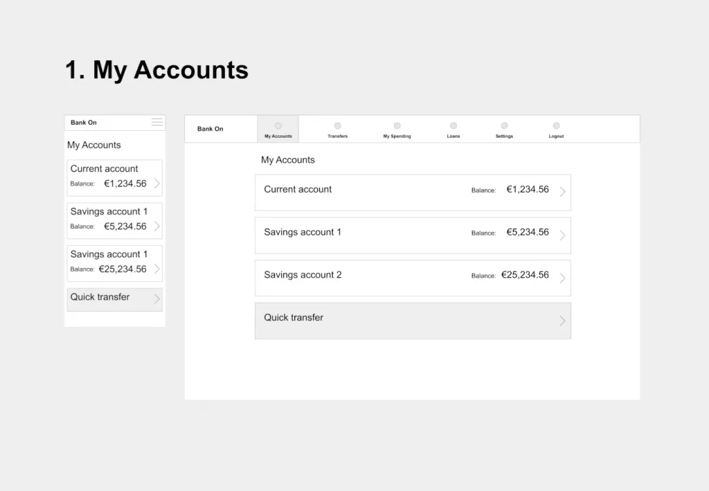
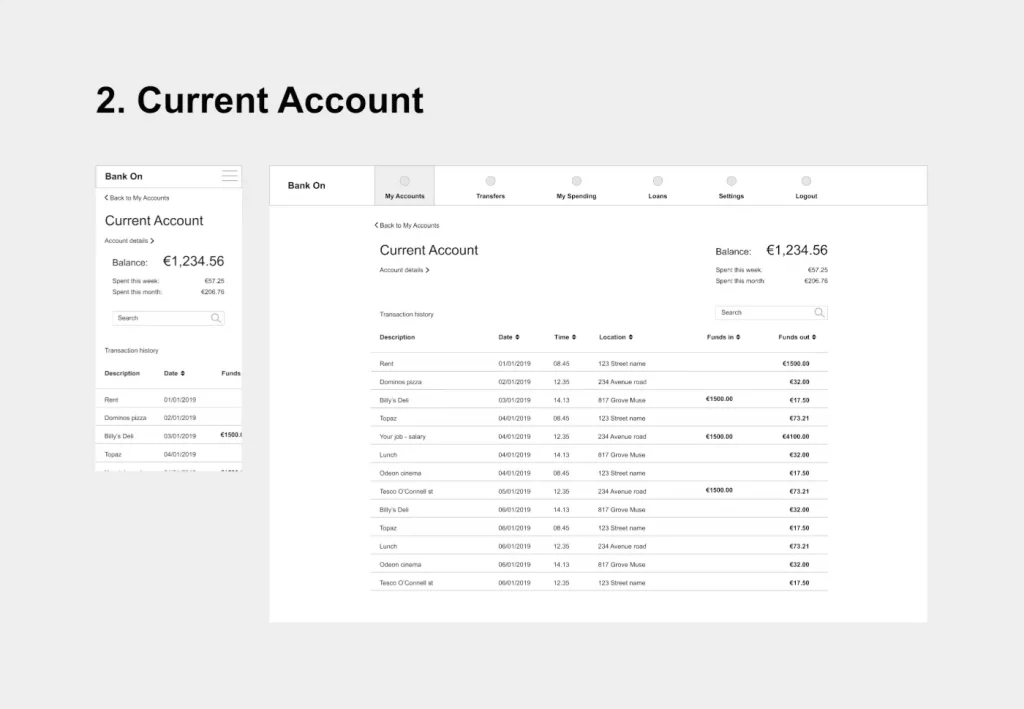
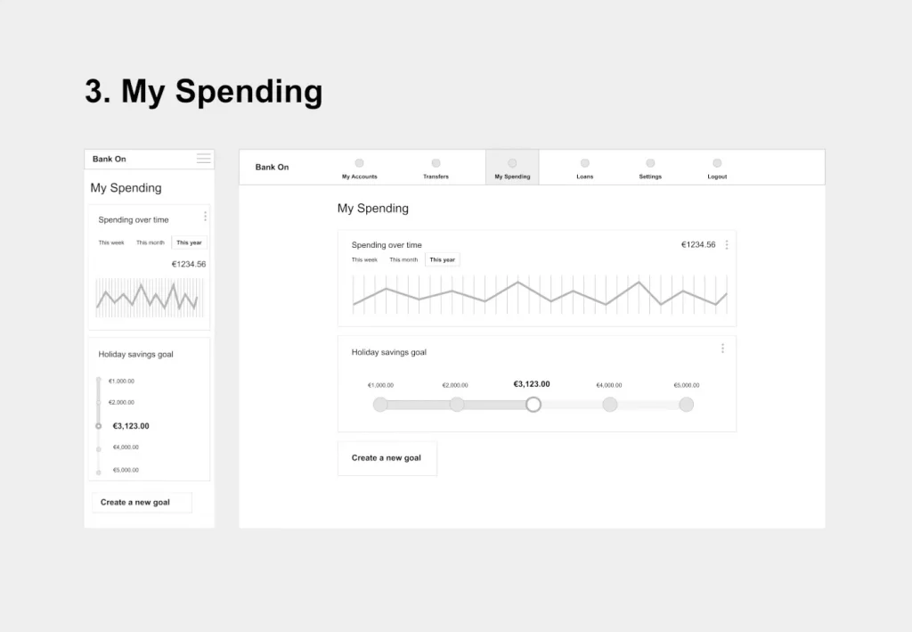
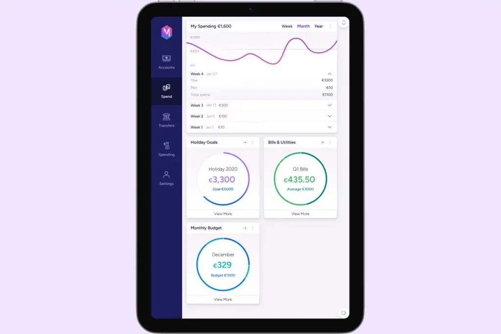
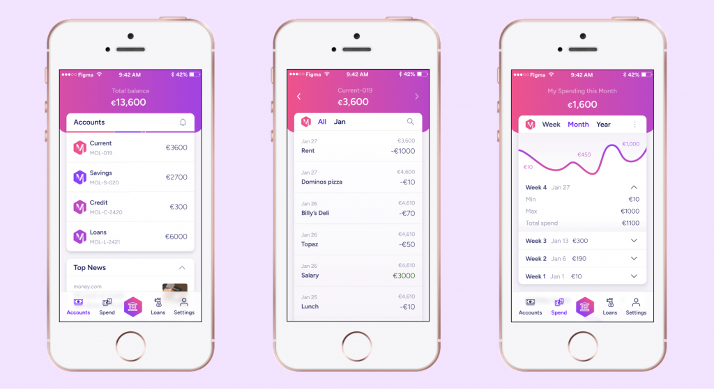
The Final Designs
Here are the final high-fidelity designs for the Account Summary screen, shown across mobile, tablet, and desktop breakpoints.
Desktop view
iPad view


Mobile view
Reflection & Key Learnings
This project was a fantastic opportunity to apply theoretical knowledge to a practical challenge. My biggest takeaways were:
- The Importance of a Structured Process: In a real-world environment, it’s easy to react quickly. This project reinforced the value of a methodical design process—from defining the brand to executing pixel-perfect details.
- Accessibility is Non-Negotiable: Applying contrast checking and focusing on legible typography highlighted how crucial accessibility is to good design. Using HSL for colours made creating an accessible palette much more intuitive.
- Balancing Creativity and Convention: The most rewarding part of the challenge was finding the right balance between a creative, unique brand identity and the conventional, user-friendly patterns that build trust and usability