Counter Redesign
Role:
Deliverables:


Streamlining Legacy Counter Theming
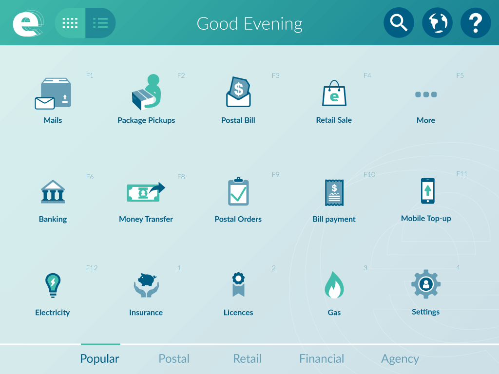
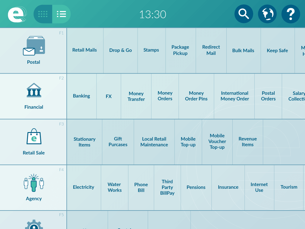
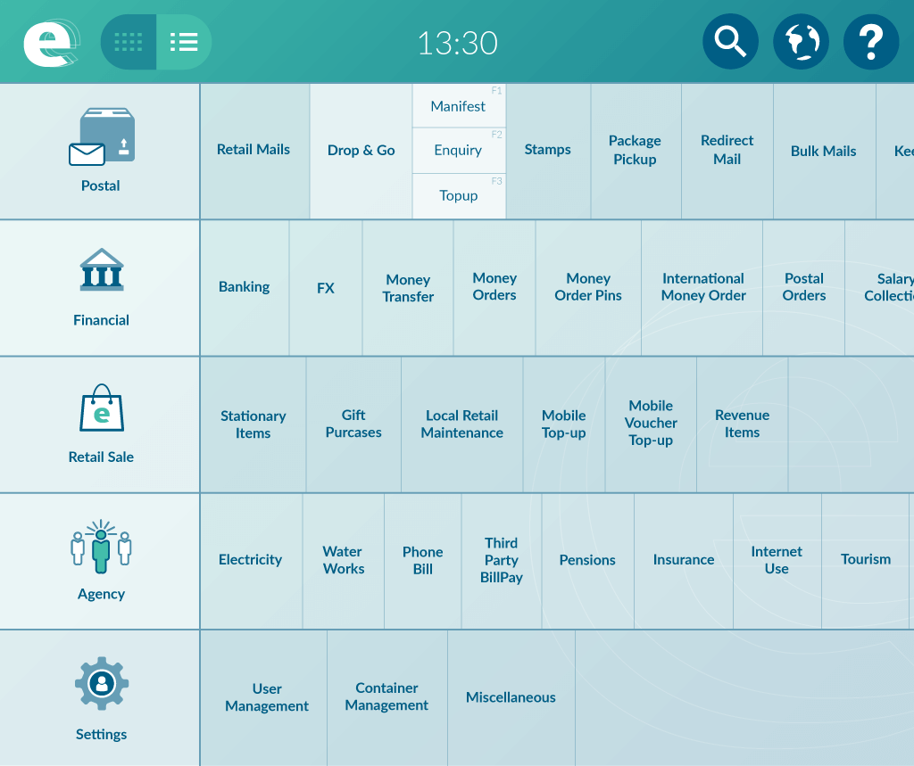
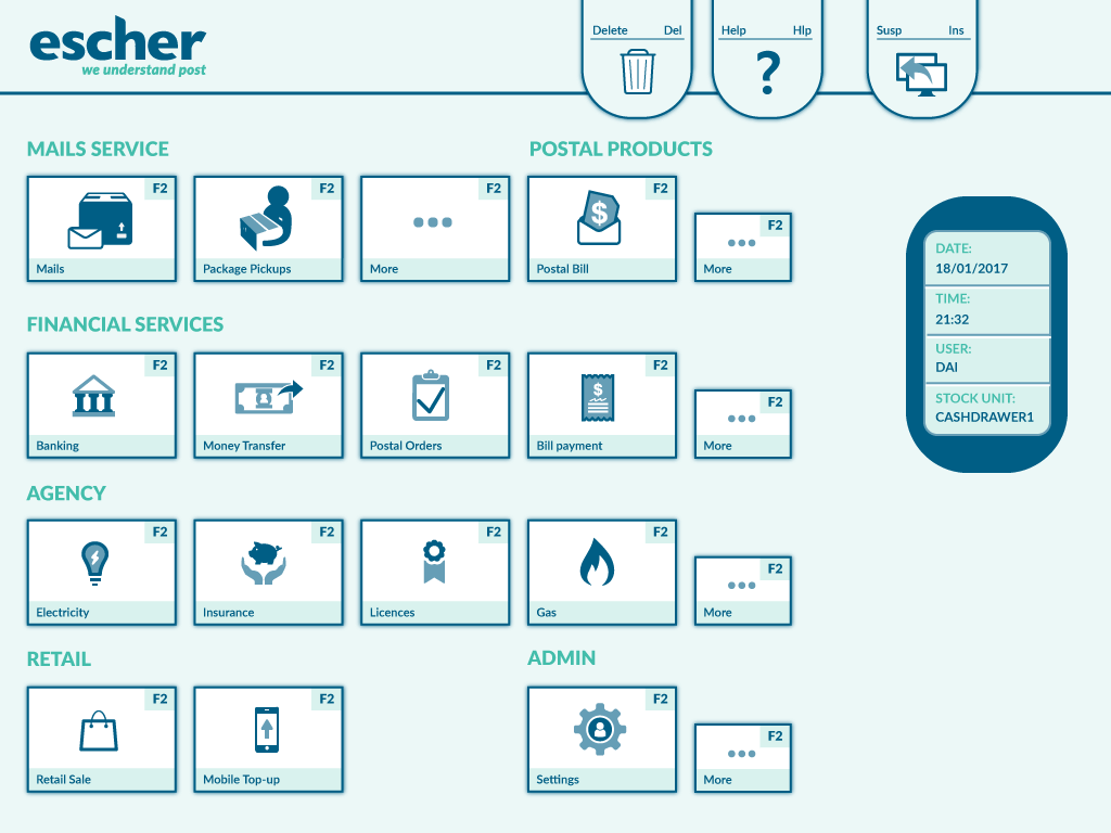
Below shows the legacy system showing the old format. The UI constraints here is very restrictive in what you can change and because of this interface is being use by post offices all over the world, I had to be mindful of what I could change. Icons were all redesigned and change to the new Escher branding. Colours are programmed in config files and by changing hundreds of image slices. So to work out how to streamline this process for our customers took a lot of work. In truth this task has not been attempted in over 10 years due to the difficultly, the know all and time it takes to change. So what did take a few months, now be done in a few weeks. This allowed the sale team to upsell and increase the company’s bottom line.
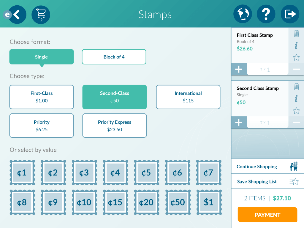
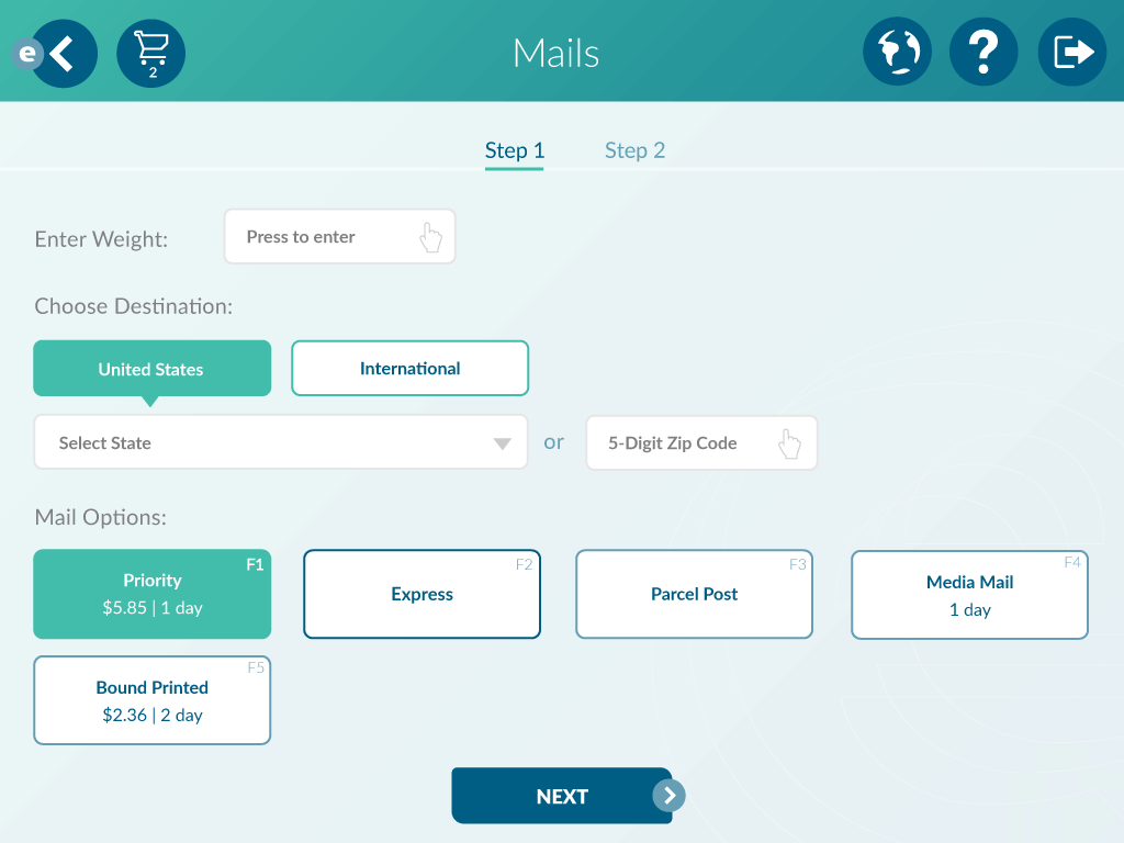
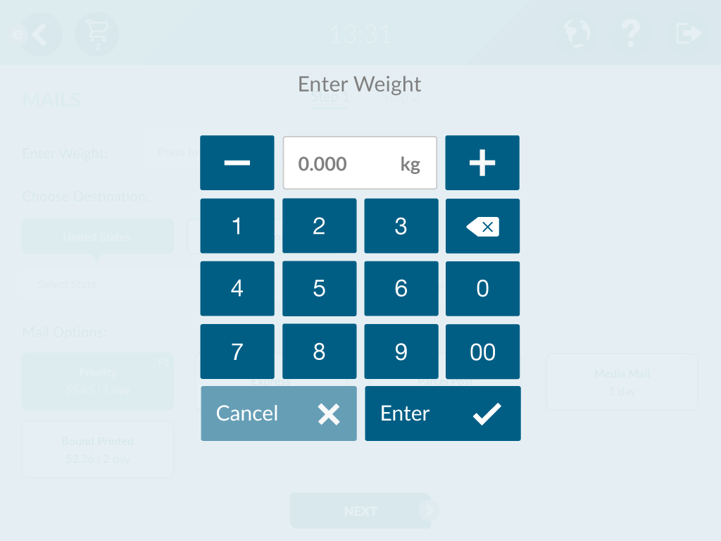
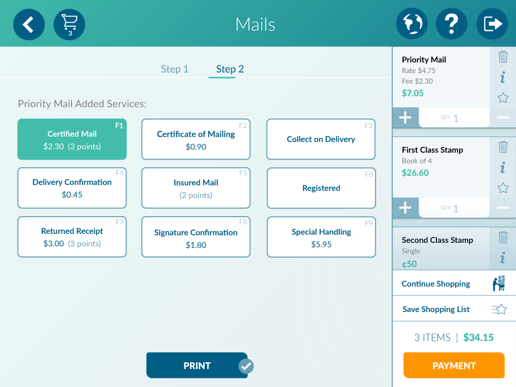
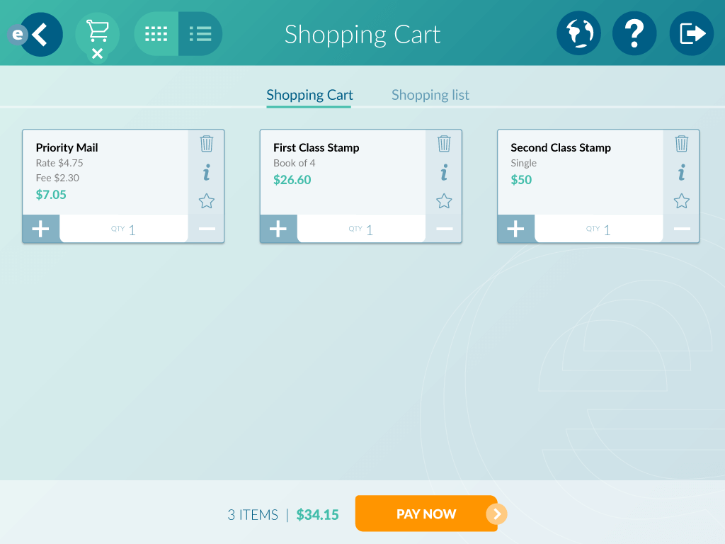
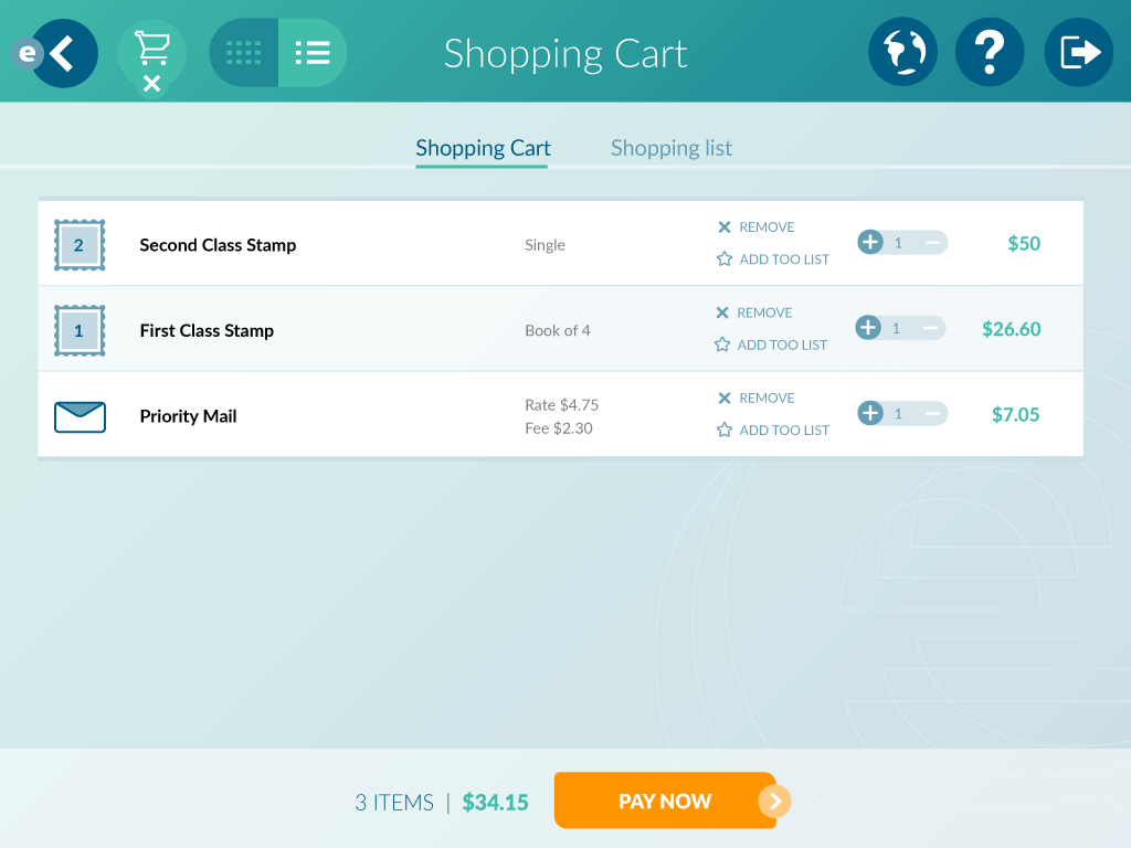
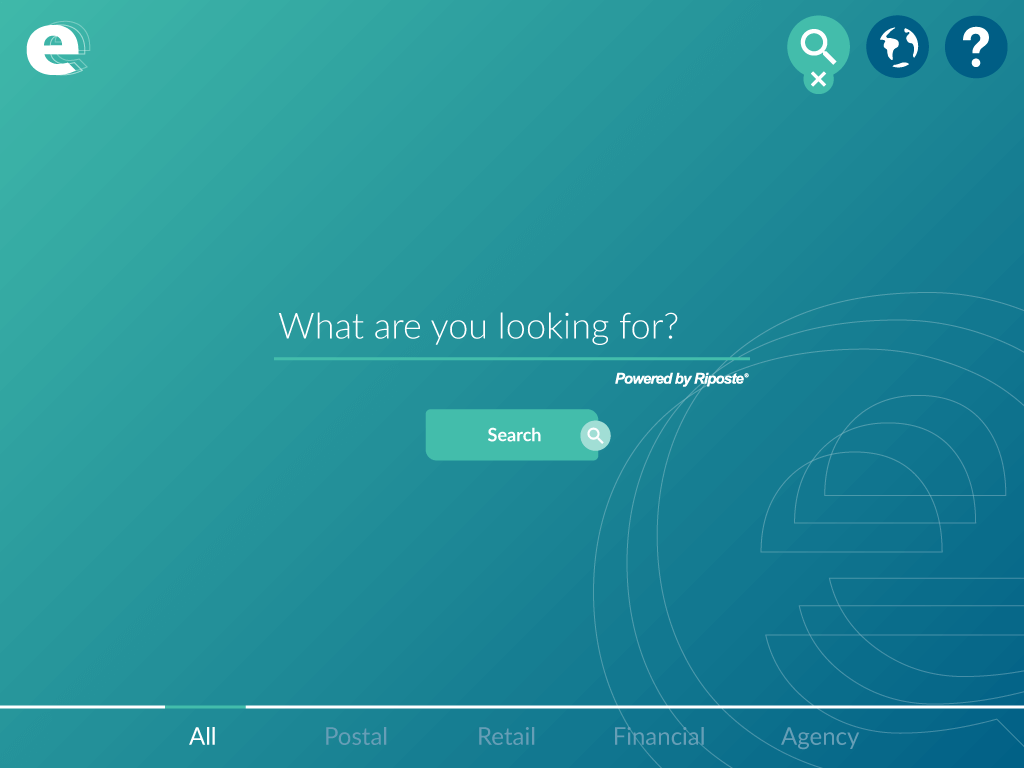
Newer look below show what the tech team is advancing to, Windows Presentation Foundation (WPF) IU which allows more rich interfaces and better user experiences and animation.
The lastest WPF interface can be seen here with Norway Post