 North East LEP
London Growth Hub
Role:
Deliverables:
The North East LEP works to make the North East a place where more businesses invest grow and prosper, through the delivery of our North East Strategic Economic Plan. Through the economic plan we will create more and better jobs for the North East and achieve over one million jobs for the North East economy.
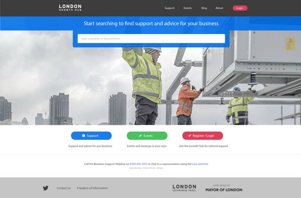
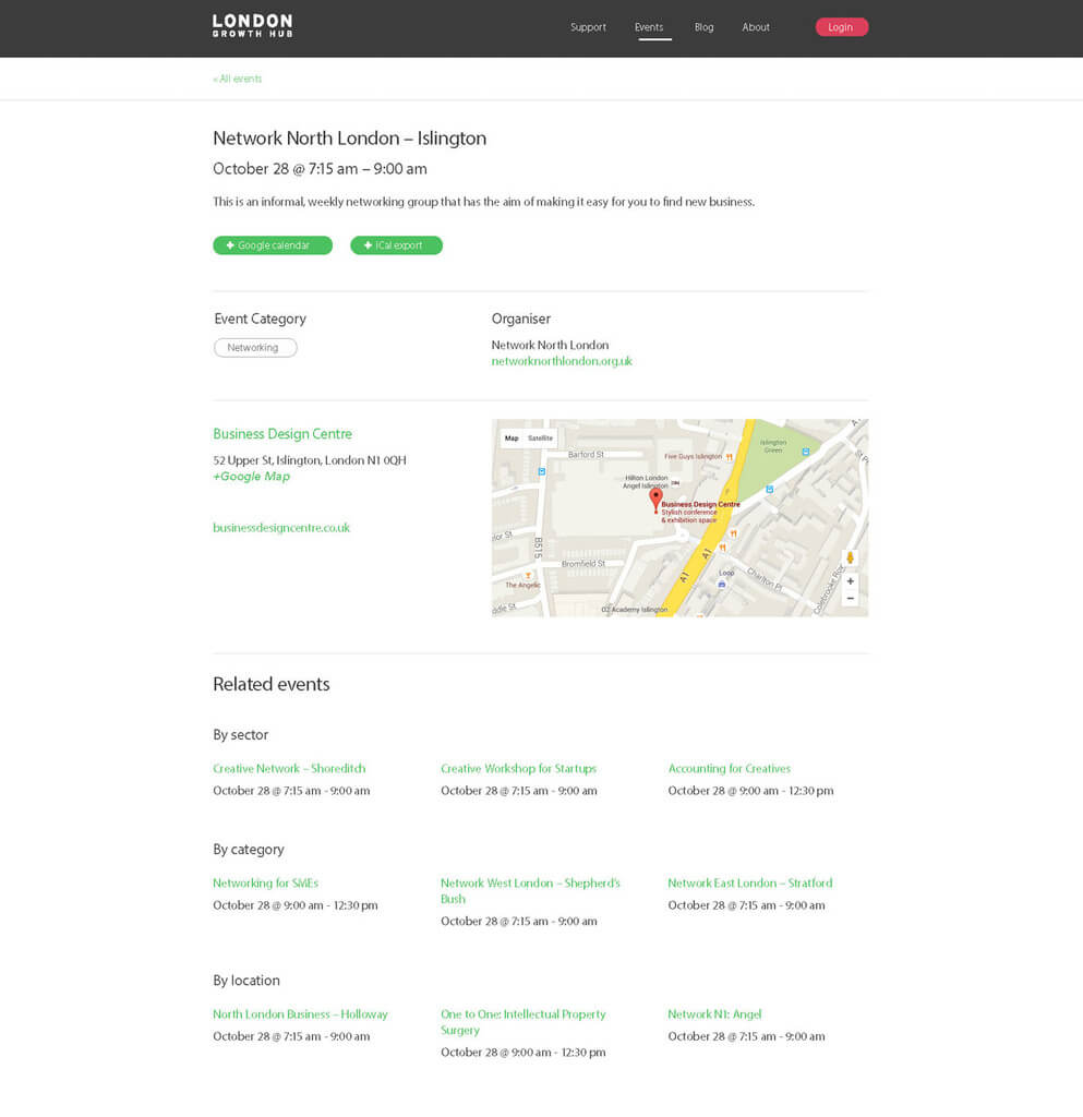
Brand Strategy
Positioning the region as a dynamic, forward-thinking economic powerhouse committed to sustainable growth and innovative business development. Leveraging a professional colour palette that balances gravitas with modernity to communicate a clear vision.
- Primary Dark Grey: Represents professionalism and stability
- Blue: Represents trust and depth
- Green: Symbolizes growth and economic development
- Pink: Adds a modern, dynamic accent
Mobile


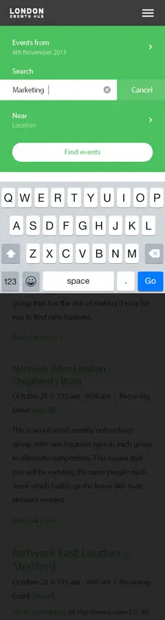
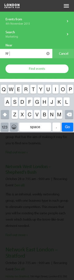
Product Strategy
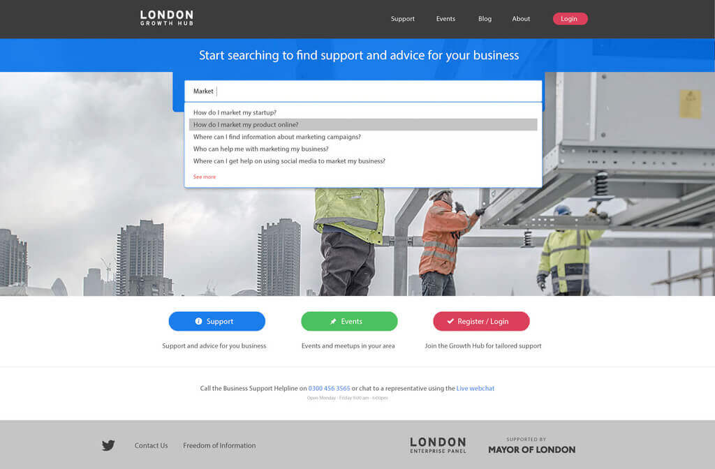
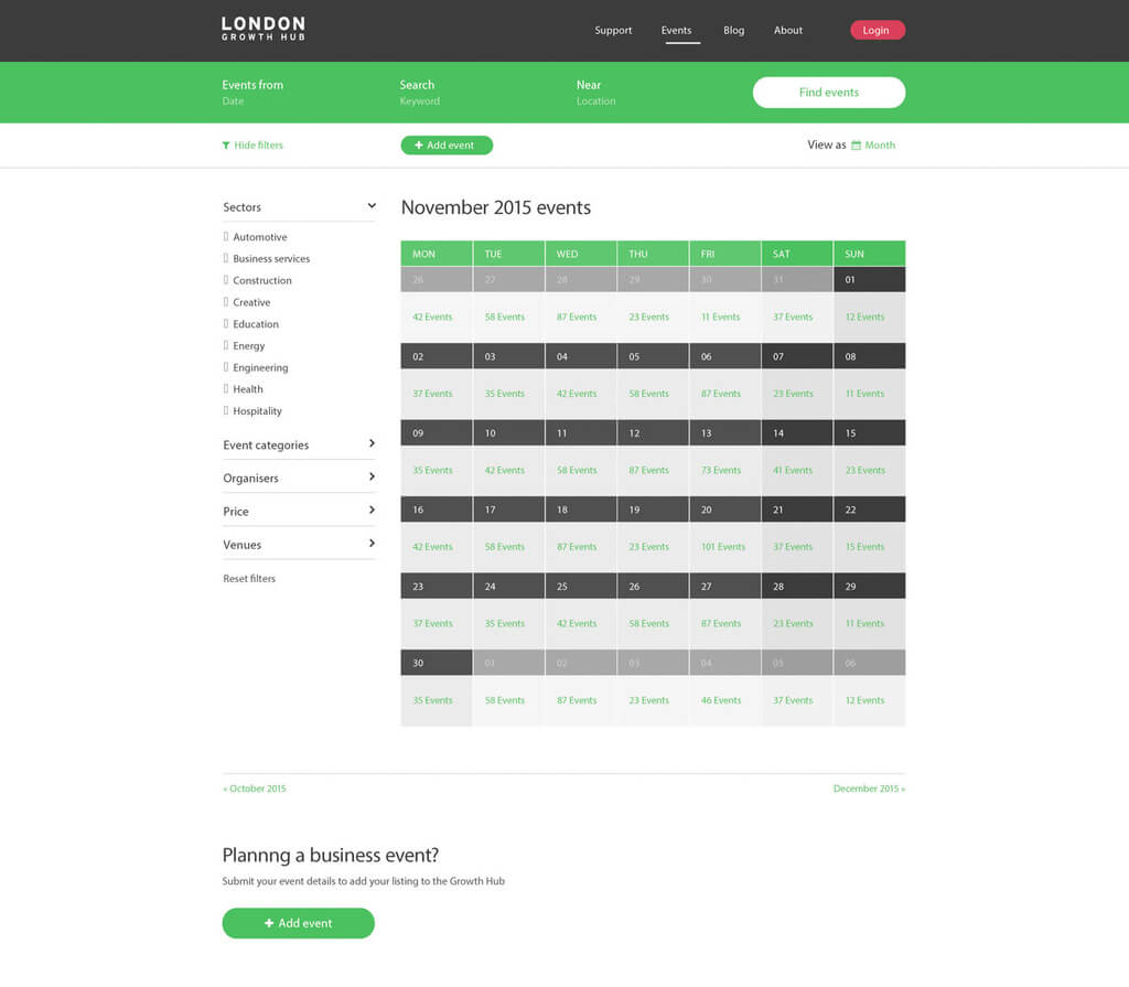
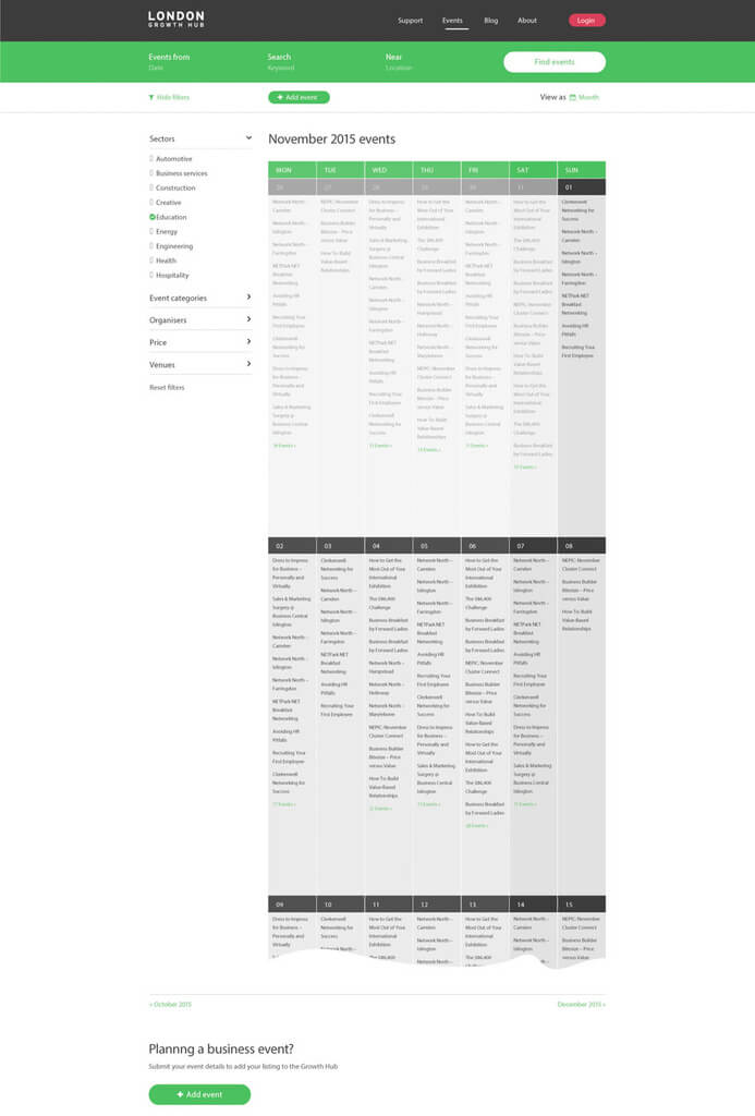
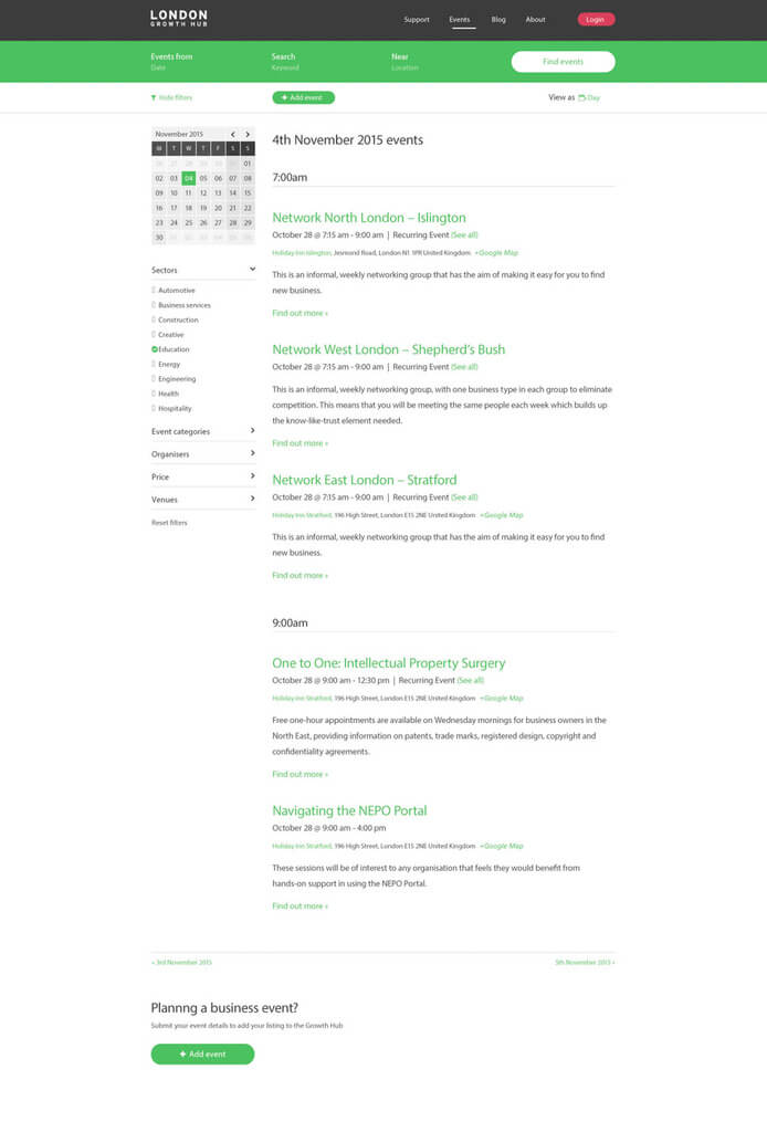
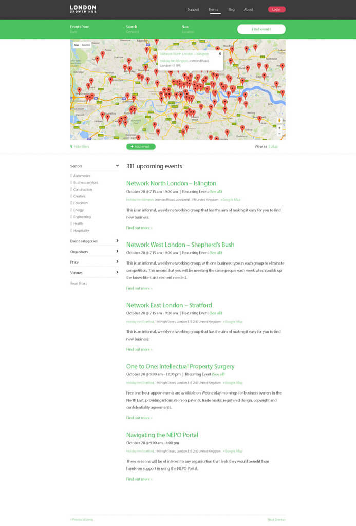
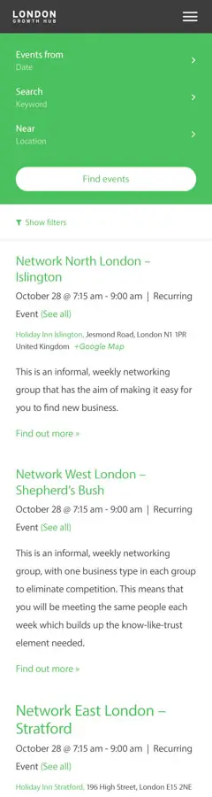
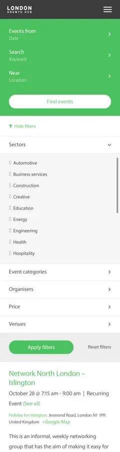
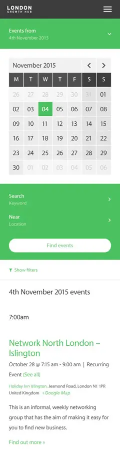
London Growth hub we redesigned for better usability and searchability by introducing auto complete search to the homepage. Users could select, research focused, questions they wanted answers to. This was a creative solution that enhanced the usability and maintained aesthetics. Improving quicker user flow and higher convention rates. This prevented UX debt by leaning into conventions.
- Autocomplete search functionality
- Curated, research-focused question selection
- Creative solution maintaining aesthetic integrity
- Improved user flow
- Prevented UX debt by adhering to design conventions
Key UX Principles
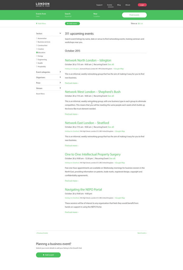
- Enhanced searchability
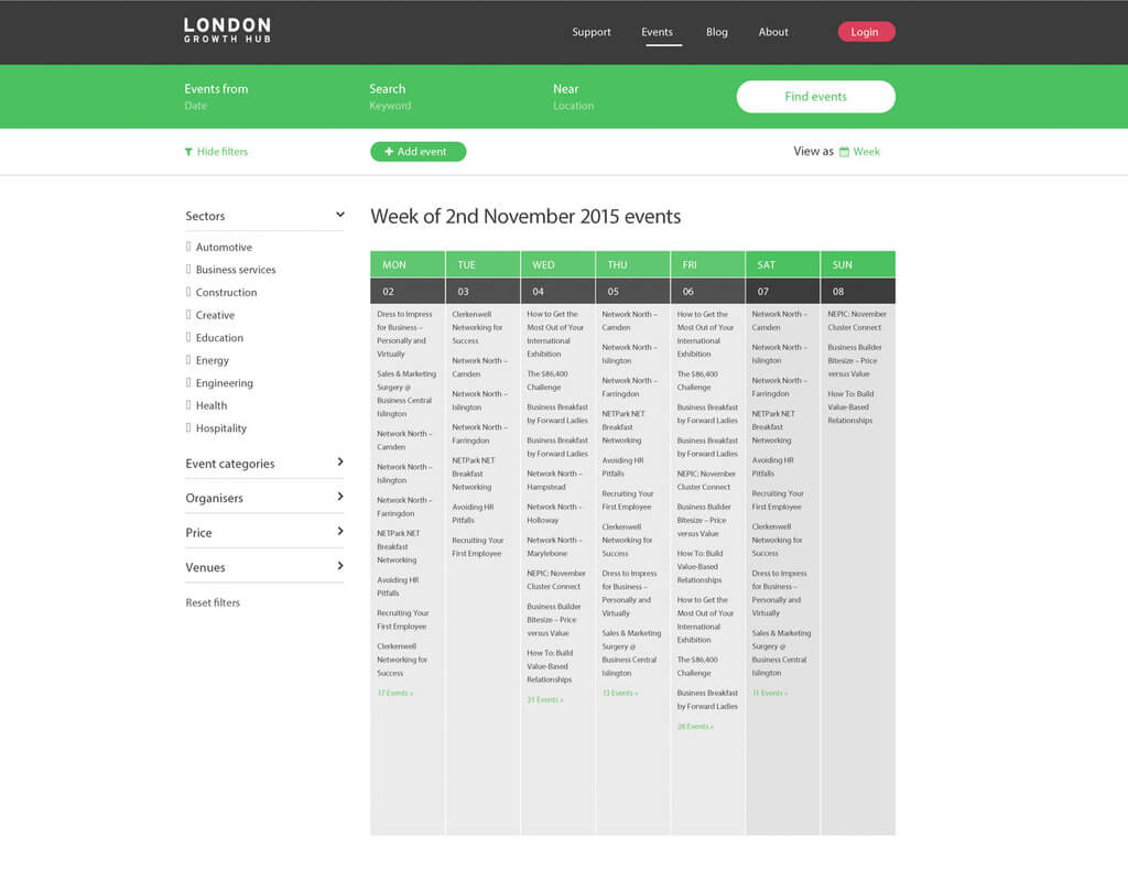
- Effective search result display
- Filtering and sorting options
- Faceted navigation
- Reduced cognitive load
- Intuitive information discovery
This user-centric approach focuses on making information discovery more intuitive and efficient. By introducing autocomplete and curated questions, the design reduces cognitive load and helps users find information faster. The emphasis on maintaining aesthetics while improving functionality shows a sophisticated understanding of design balance.
Core Principle
Brand UX + Product UX = Product Singularity