
FlyUX App
Role:
Deliverables:
Flight Booking App
Although airlines are often on big budgets, most of their flight booking experiences are rather unpleasing. The goal of this project is to improve this experience for a fictional airline, in order to turn the booking experience into a smooth and straightforward process. Fly UX is a start up airline and they are looking to create an online booking experience that is fast, intuitive and easy. Using great design to give their product a competitive advantage.
The UX Process
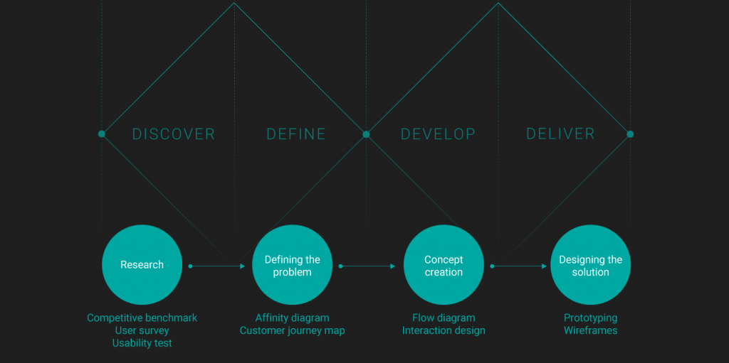
1. RESEARCH
Understanding the problem starts with solid research. Since this phase is such an utterly important part of UX design, the problem is analysed using three different methods:
- Competitive benchmark
- User survey
- Usability test
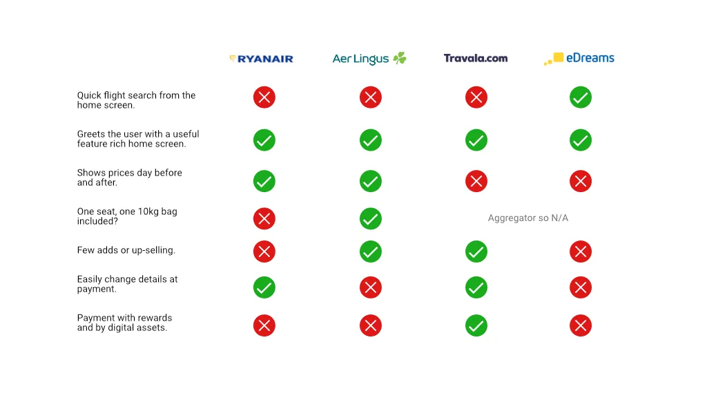
1.1 Competitive Benchmark
By analysing 2 airline competitors and 2 aggregator applications, conventions within the flight booking process were found. Further, by using the design heuristics, best and poor practices were pointed out. Some of the key takeaways are:
- Labelled flights (‘cheapest, ‘fastest’, …) speed up the decision making.
- Prefilling fields based on location saves the user time.
- It’s often unclear if the shown price is the total amount or the amount per person.

1.2 User Survey
The goal of the user survey was to find out more about the user’s behaviours. A simple 5 question using SurveyMonkey showed that most people visit the airline application multiple times before booking and that price is by far the most important booking factor.
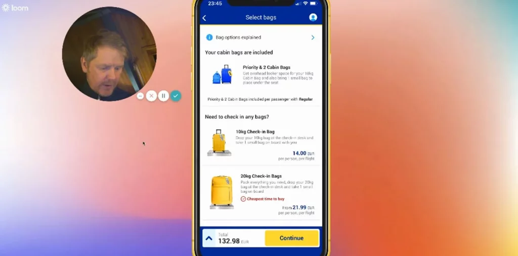
1.3 Usability Testing
Usability testing, The holy grail of UX design. After a short introduction and a user interview that was focused on previous experiences with airline applications, the users were asked to perform two tasks using yet existing airline applications. This clearly pointed out where the pain points in the booking process are located and where frustrations occurred.
1.4 Note Taking
Notes where taken from recordings of usability tests for airline booking applications and websites. Notes where made on the users goals, behaviours, mental models, pain points and contextual information.
Pain points, positives and neutral aspects where colour coded. This allowed me to make structured highlights of the key insights observed.
2. DEFINING THE PROBLEM
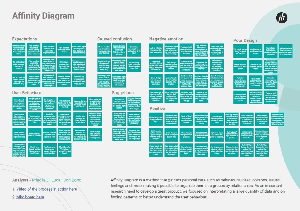
There is no point in collecting data when it’s not properly organised and analysed afterwards. In order to do this, two tools are used:
- Affinity diagram
- Customer Journey Map
2.1 Affinity Diagram
By writing down all key findings of the research phase on post-it notes and organising them by category creates order out of chaos. It makes clear which challenges the user has to overcome in every step of the booking process.
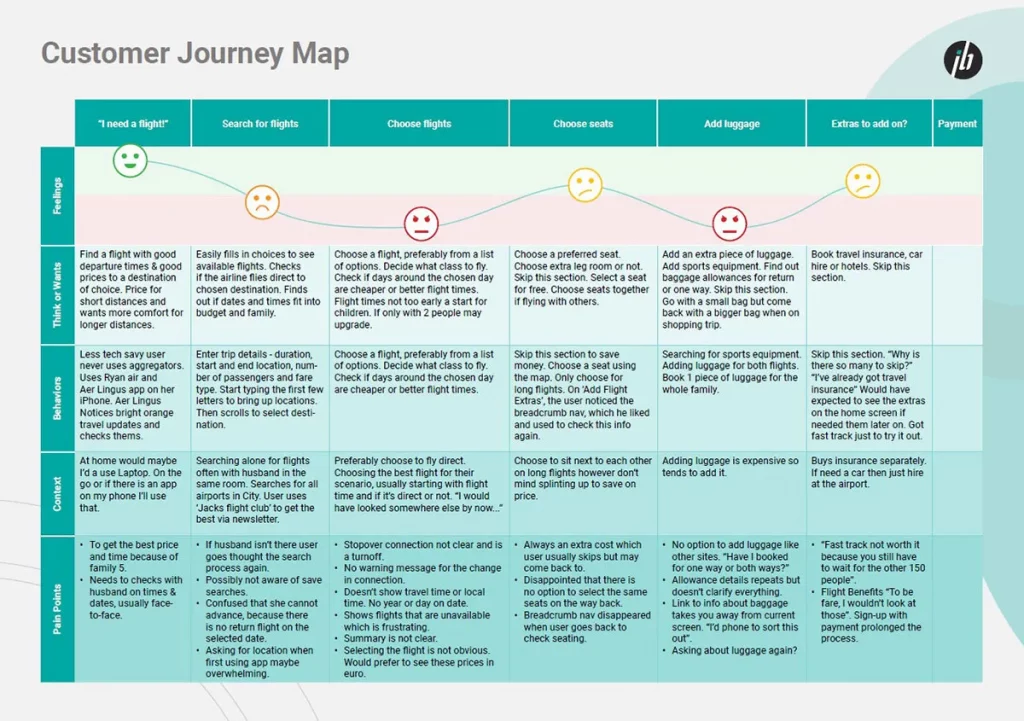
2.2 Customer Journey Map
Listing up the context, goals, behaviours, pain points and mental models of every step and linking that with the users’ emotions, creates the perfect summary of the collected data. The customer journey map is the ideal starting point to start working out the flow and also a very strong tool to communicate with stakeholders.
3. CONCEPT CREATION
Having clearly researched and defined the problem, it’s time to start creating. To ensure a structured process following steps were first completed:
- Flow diagram
- Interaction design
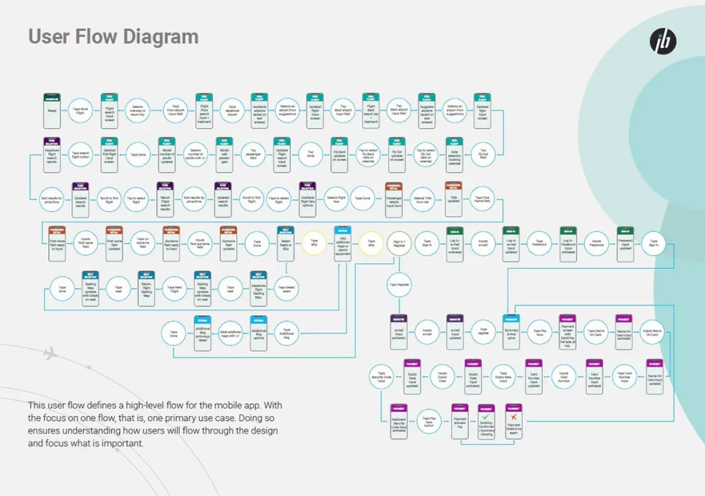
3.1 Flow Diagram
Since the booking process is a clear linear process, defining the flow before starting sketching is a must.
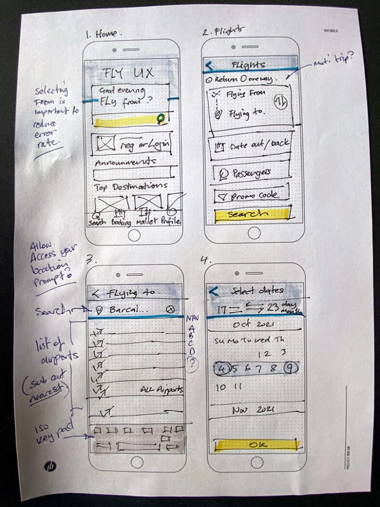
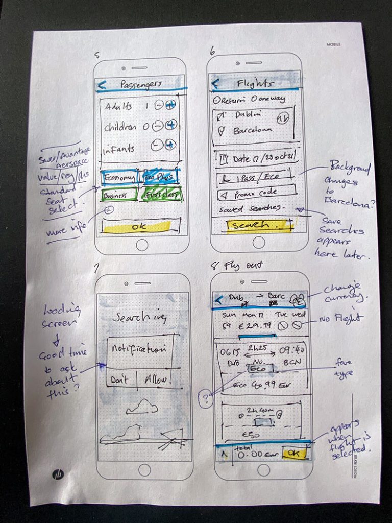
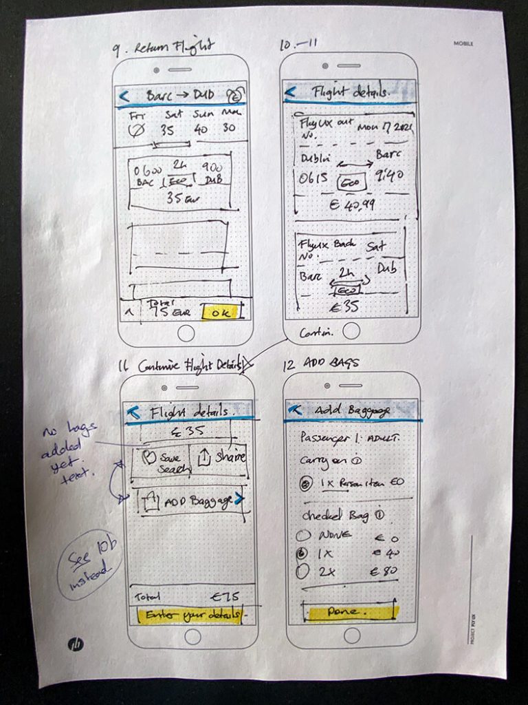
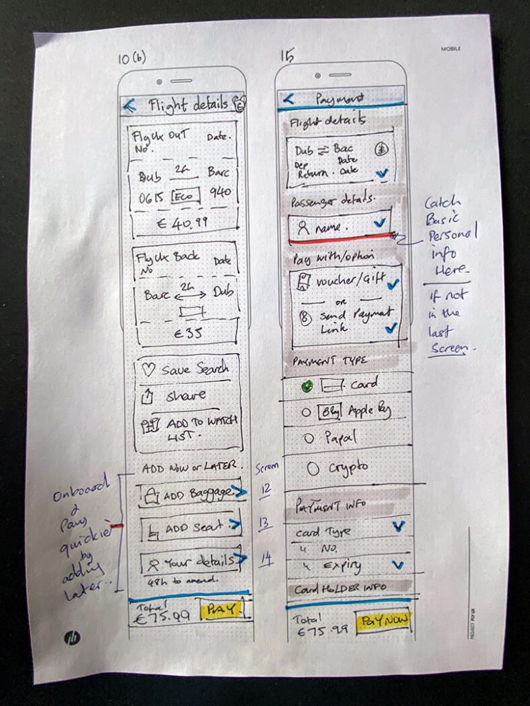
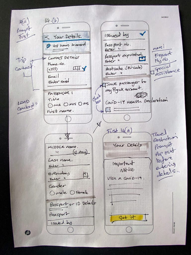
3.2 Interaction Design
No better place to start designing than on paper. The keyword here is iterations: fast and easily sketching different possible solutions in order to find the best fit.


4. DESIGNING THE SOLUTION
The final stage! Two more things left to do:
- Prototyping
- Annotation
4.1 Prototyping
Using Figma the sketching are brought to life. The complete happy path of the customer is worked out in this interactive medium-fidelity prototype. Don’t hesitate to try it out!
Conclusion
As this project offered me the chance to practise every aspect of UX design, from research to prototyping, I was able to master a lot of new skills. Thanks to the strong focus on UX research in this project, I was able to implement improvements in the design process. Of course, UX design is an iterative process and future testing should point out where further improvements could be made. With strong UX research enables me to make better design decision and design with purpose.
One thing I’d like to explore is giving a product a unique identifier (UPIs) which would make it stand out from other apps in the industry. One way to do this is though new technology. One of those ideas that I started to explore was the introduction of a Crypto wallet. It is my belief that user will get rewarded for being loyal, not only by just using the app but, by investing and staking apps tokens. This token may acted like a dividend stock and as a utility token. Imagine an app feature that can be unlocked by the amount of tokens you hold, lock or stake. Crypto can not only streamline the payment process but also revolutionise loyalty reward systems. How this token would actually work, or ‘Tokenomics’, is something from a UX perspective would be interesting to explore.
Process Evolution 2026: Beyond the Double Diamond
While this case study follows the traditional ‘Double Diamond’ framework—which was the gold standard when I began this project—I have since evolved my perspective based on the current shift in the AI-driven design landscape. Industry leaders, such as Jenny Wen (Head of Design at Claude), have noted that the traditional cycle of lengthy research and exhaustive mocking is being replaced by ‘Trust through Speed.’
In future iterations of FlyUX, I would pivot from high-fidelity mocking toward rapid, functional prototyping. By leveraging AI to automate the ‘last mile’ of design and code, I could move faster into real-world testing. This would allow me to validate the ‘UPIs’ and ‘Tokenomics’ mentioned above through actual user behavior rather than theoretical discovery, acknowledging that in the modern era, execution is the highest form of research.